A very wobbly font
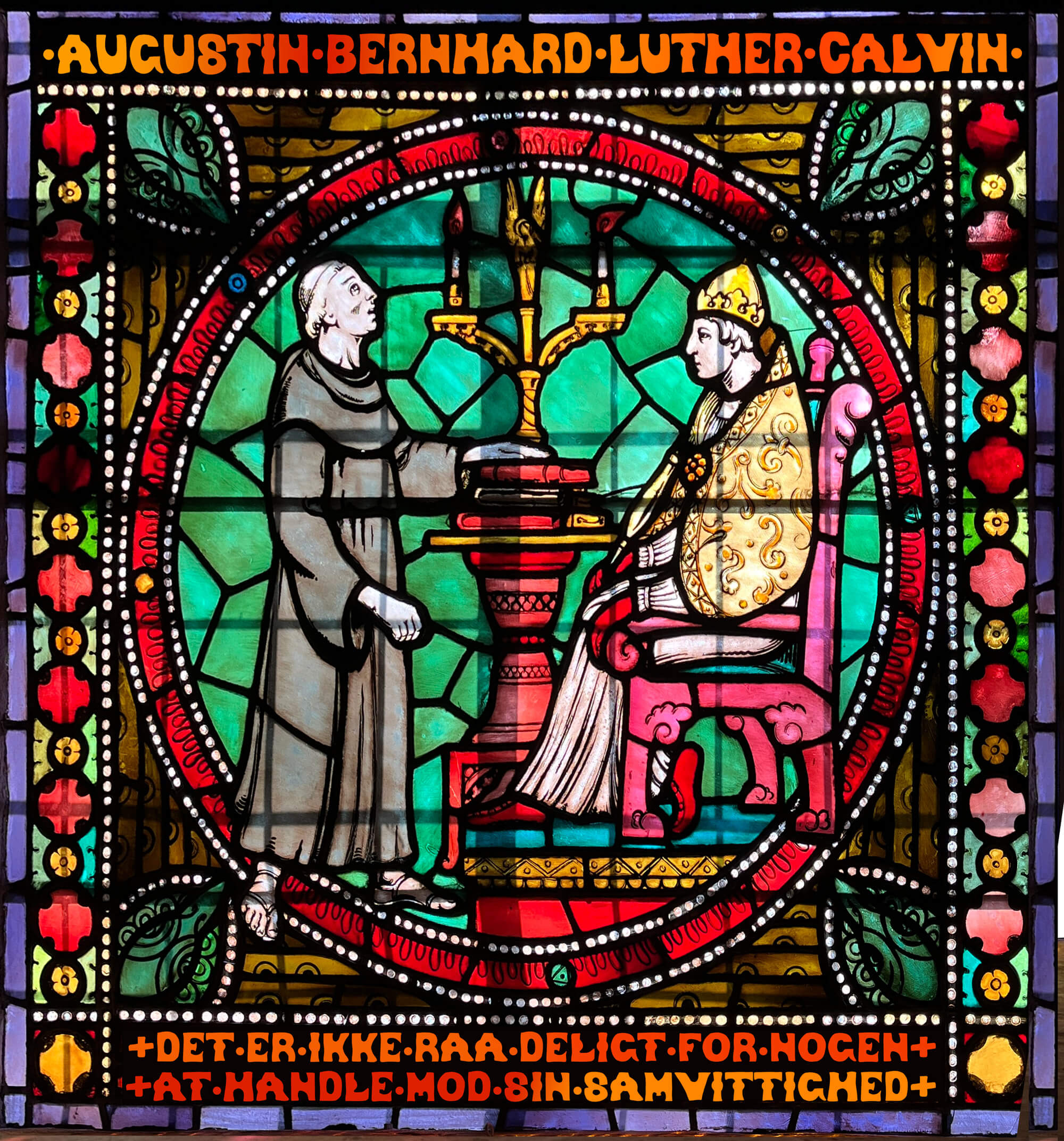
This summer, I visited Oslo for the first time - including dropping in at the Oslo Cathedral. There in the choir loft is a series of stained glass windows, with some incredible hand-lettered text.
 </a>
</a>
It was blobby, wobbly, and perfectly suited for its task - letting in as much light as possible, while still being readable. It had such a unique character - I photographed a bunch of reference images.


Introducing Oslo
In fact - I loved it so much, I made a real working font out of it.
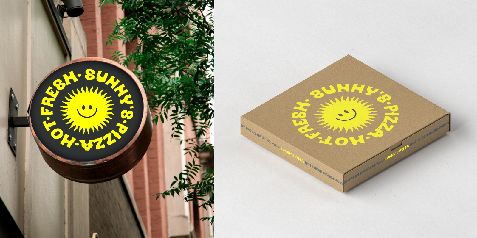
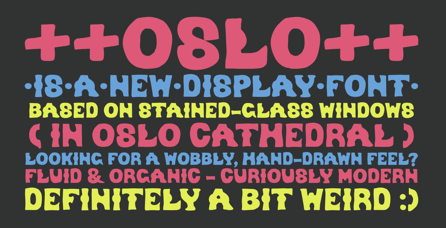
Thus: OSLO is a wild display font, based on the stained-glass windows in Oslo Cathedral. It’s got a wobbly, hand-drawn feel, as suited to its original context. It looks great jammed up together with text, and in high-contrast situations.
The original letterforms were designed and painted by the Norwegian artist Emanuel Vigeland, who created the entire stained glass windows in the cathedral choir area. (His brother Gustav was a prolific sculptor, too!)
OSLO is a single-case display typeface. It has only uppercase letters, numbers, and most (but not all) punctuation and symbols. It’s got a handful of accented characters as well! It’s definitely not your choice for big sections of body text, but it’s a bold choice for fun display situations.
And you can get it, too. I put it up here with more examples, and you can buy yourself a copy (for cheap!) if you ever need a very wobbly, but weirdly modern display font.


