We still can't design credit card machines
Why does every credit card machine require a little handwritten sign telling me how to operate it?
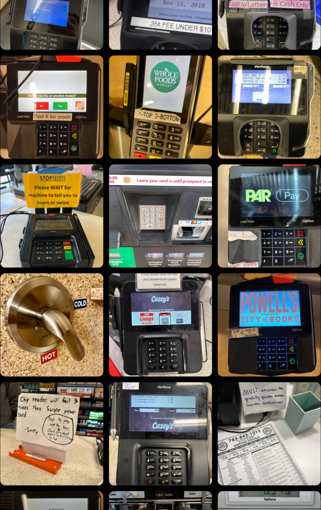
As someone who studied industrial design in college and now works exclusively in digital interfaces, I LOVE this question.
Physical interfaces are hard to change! Once they’re designed and manufactured, the users are stuck with the designer’s choices. And so we annotate, modify, and otherwise hack the interfaces we have to use.
You’d think we’d have this worked out by now. There are only so many ways to use a credit card, right? But as John Salvatier says: Reality has a surprising amount of detail.
And so, when the designers didn’t give us an interface that matches up with the real world, we improvise.
And this isn’t limited to credit cards either! Once you start looking, you’ll see this everywhere:
The post-it explaining that you have to press X, then the red button, THEN tap your card HERE.
The giant labels reading HOT and COLD on the shower handle (which if you look closely already has labels but are also wrong).
The duct tape covering the switch that SHOULD NEVER BE FLIPPED.
I have a treasured collection of annotated interfaces, and I’m collecting them here. I started this collection focused on credit card readers, but I’m expanding to annotated interfaces anywhere. Spotted one in the wild? Send it to me, I’d love to see it.